Irresistible Mobile App Design Trends For 2016!

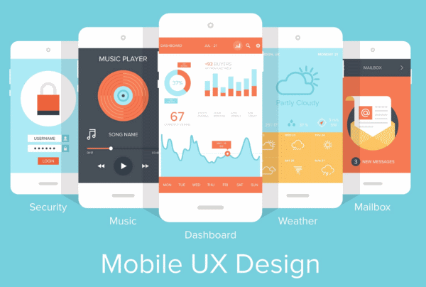
Design thinking has undergone a sea change in the past few years with the proliferation of new operating systems, new devices and a newer set of audiences that are embracing technology for the first time in developing world. Those who have had experience with desktop computing have vastly different expectations than those that are using the mobile as the gateway to the world for the first time ever in their lives.
Source: Elegantthemes
UI/UX Undergoing A Sea Change
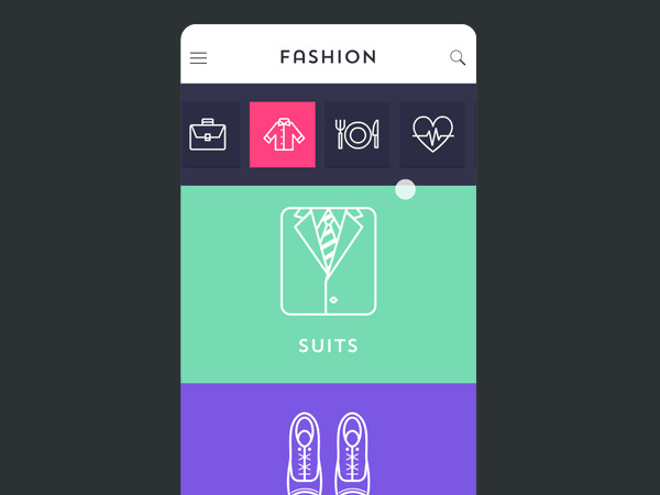
This is the best thing to happen to the user community as earlier interfaces were built by keeping one key aspect in mind that even a child should be able to use the devices intuitively. But this thinking has undergone a sea change. As more old age and middle-aged users join the bandwagon and desire explanatory interfaces where app hierarchy is clearly explained and they desire card based layouts that are easier to grasp.
Source: Designmodo
Intuitive and Immersive User Interfaces Taking Shape
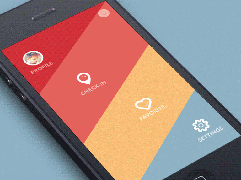
Lesser screens, bigger screens, reduced thumb interventions and interfaces that can move on the Z-axis and dissolve themselves to yield more information about a given functionality are the new normal in the design industry. Designers do not take a data –driven approach to solving problems and examine a problem from all angles in its entire entirety. And with phablets, wearable computing, augmented reality, virtual reality and the internet of things technologies about to be unleashed after the development of pre-defined protocols, new sets of interfaces will emerge that will try to deliver the information desired by the user in the minimum possible time.
Source: Episty
Material Design with Flat Interfaces Comes Out on Top
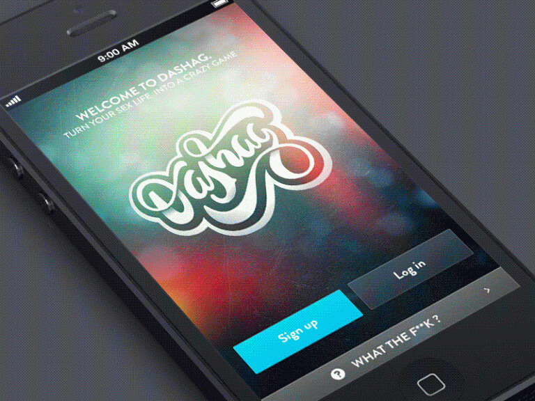
Judging by audience reactions and by analyzing smartphone sales in various categories, it can be comfortably said that flat design with fewer layers will stay popular. But these flat designs will be fused with subtle shadows, glow effects, gradients and similar such elements. This will enhance visual appeal, create user delight and can help phones command higher prices in the market.
After all, no matter how sleek the metal body maybe with gold or silver plated back covers that can enable charging or the ones in rose gold color but it is the user interface that ultimately grips the attention of the users for years.It started to get absorbed in the beauty of the touch type or slide & swipe system that has been developed by the designers working in conjunction with the operating system authors and application authors both working to increase the time spent by users in the app to trigger in –app purchases and improve reach cum engagement that will in turn increase the brand’s bargaining power with advertisers’.
Source: Designmodo
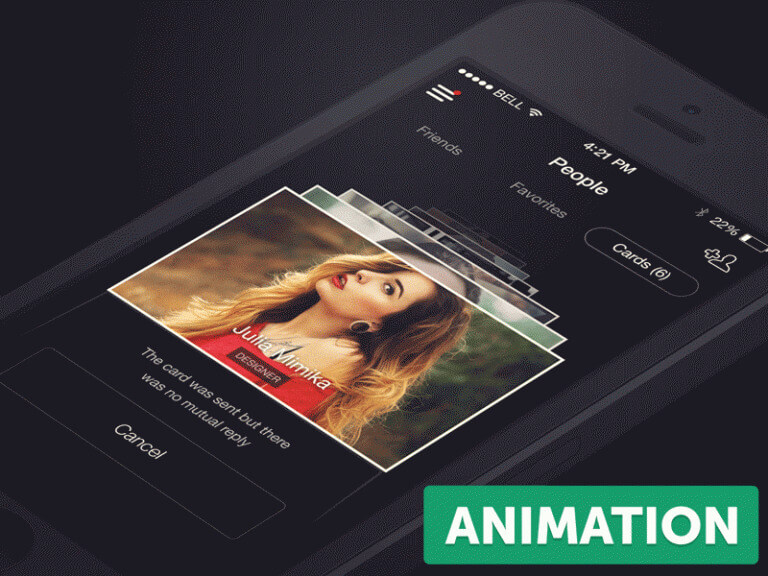
Enter Functional Animation and Motion Design
Think about it! What exactly do you desire from an app or an operating system in the true sense of the word? The answer most likely you have on your mind is that it should be simple, vivid, insightful, beautiful. And most of all purposeful and can help him become more efficient with each passing day. Functional animation and motion design achieves this very purpose and helps technology companies connect better with their audiences.
Source: Designmodo
A Quick Wrap Up
Trends are nothing more than some amazing tools in your designer toolbox to give a unique touch. That’s why it is important to always pick the right ones for the job.
If you are looking for an iPhone App Development, Signity Solutions a name I prefer for Startups & SMEs.


![Redesigning Your Website? 4 Actionable Tips [Bonus Tip Included]](https://www.signitysolutions.com/hs-fs/hubfs/Imported_Blog_Media/Focus-on-UX-SignitySolutions-1.png?width=352&name=Focus-on-UX-SignitySolutions-1.png)


